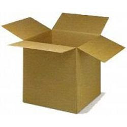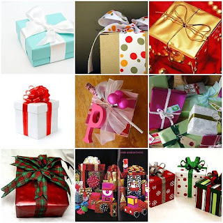
And cue to the scene where your customer has just received your package. He has the box in his hands ready to reveal what's inside..... excited and anxious he tears through it to find a plain white notecard, and your {insert product here}, at the bottom of the box.
Awww what a let down, even though he loves your product the first impression from your
presentation didn't hit that sweet spot that could've pushed your products into that warm fuzzy we all like to have when we open something up.
What am I going on about? Why presentation of course, how your product is perceived and received when your customer reaches in, opens up or tears through your shipping container. It's something that you may or may not have thought about but it surely is something to consider when you're wanting to stand out amongst your competitors and add a unique touch.
I've always been a sucker for wonderful presentation. With all of my past and present business ventures I always make a point to take time to really consider my presentation. Here are a few things I take into account and ask myself:
-->1. What image am I trying to go for here? Do I want to be conservative and sharp, or fun and colorful.
-->2. How much budget am I willing to put into every presentation? This should in my opinion depend on your retail price of that item. If you're selling something that retails for $10 then by all means you have to get creative with your presentation because it should not cost more than $1 and that's pushin' it. But on the other hand if your product sells for say, $200 than by all means I say invest in presentation too. I'd be comfortable with $5-10 in presentation, and you can do alot with $5-10 if you've got a creative hair.
-->3. How much time do I have to invest in creating my presentation? I included this because once you get hooked on creating stellar presentations for your products you may start to go overboard. Trust me, I would spend upwards of 30-40 minutes on my total presentation of just one of my diabetes accessory orders and I had to trim it down, because to fill 3 orders a night took me hours! Stay creative but not obsessive.

-->4. Try sticking to a coehisive theme. And what I mean here is that if you're all about organic and natural products it's probably not wise to present your products in hot pink tafetta ribbons, and tulle. Just not a good look and will cause confusion for your customer. Think of your presentation as just another extension of your overall look and theme of your pet business. If your color scheme is brick, grey and white, keep this in mind for presentation as well.
--> 5. Does it photograph well? Reason being because people like to see what a gift wrapped product may look like coming from you. Plus you can play that up on your site as well, that all of your products come beautifully assembled with [insert your co name here] gift wrapped flair. Some presentations photograph very well while others take a little finessing a bit. Play around with yours and see what great shots you can get.
Most of all your presentation should create that warm and fuzzy feeling you get when something is beautifully wrapped, or just has an added personal touch. Don't feel like you have to go and buy tons of ribbons, bows and paper here either. Presentation can be a cute hand-written note on top of your products, or just a gift tag that expresses thanks for being a customer/client. Keep it simple, but don't forget that 'wow' factor!


No comments:
Post a Comment